Print Improvement
Nonsense Trading Cards
Why I want to improve this project?
I want to improve this project because I used to draw with a mouse, and I can see the imperfections of the illustrations I made back in the first semester. The card designs need a complete overhaul because it's just the name of the character on the card and the drawing. I would also like to make the cards feel like they are part of the same set despite the concept being that they are nonsensical without any connection.
Feedback from other students:
- Use a better font for the cards
- Add a new looking border
- Make more of a cohesion between the cards in some way to communicate that they are part of the same set despite the concept being they are all nonessential without connection. Maybe make a logo of the Nonesense trading card set to make it so they are all part of the same set.
- Maybe add how rare the card is (Rarety)
- Maybe make a logo of the Nonesense trading card set to make it so they are all part of the same set.
The changes I will apply:
- Redraw or redesign a few cards to be more original
- Redo card descriptions on the back of the cards
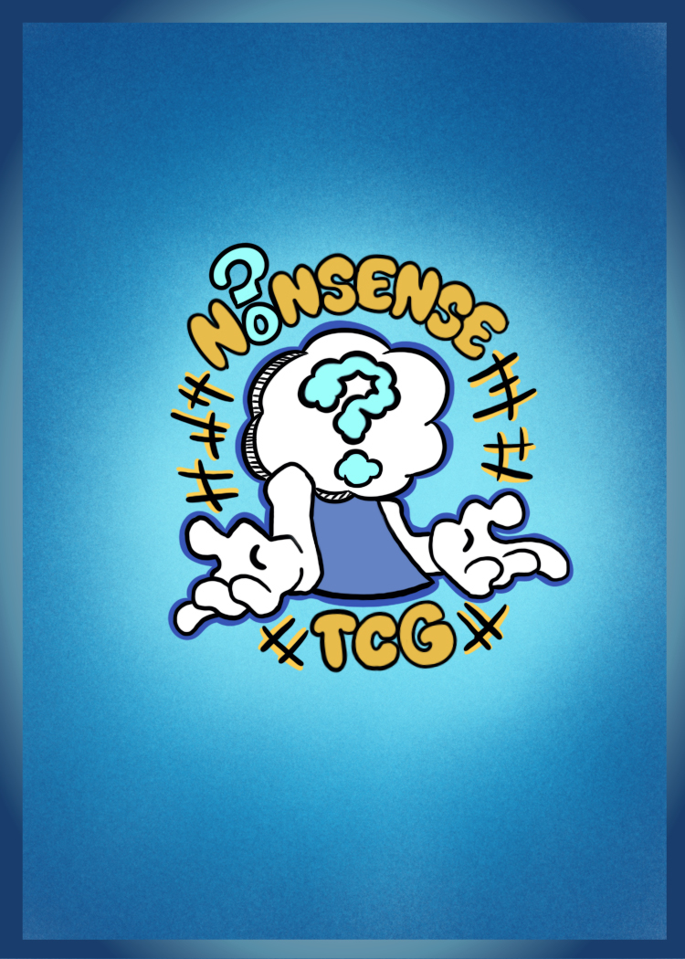
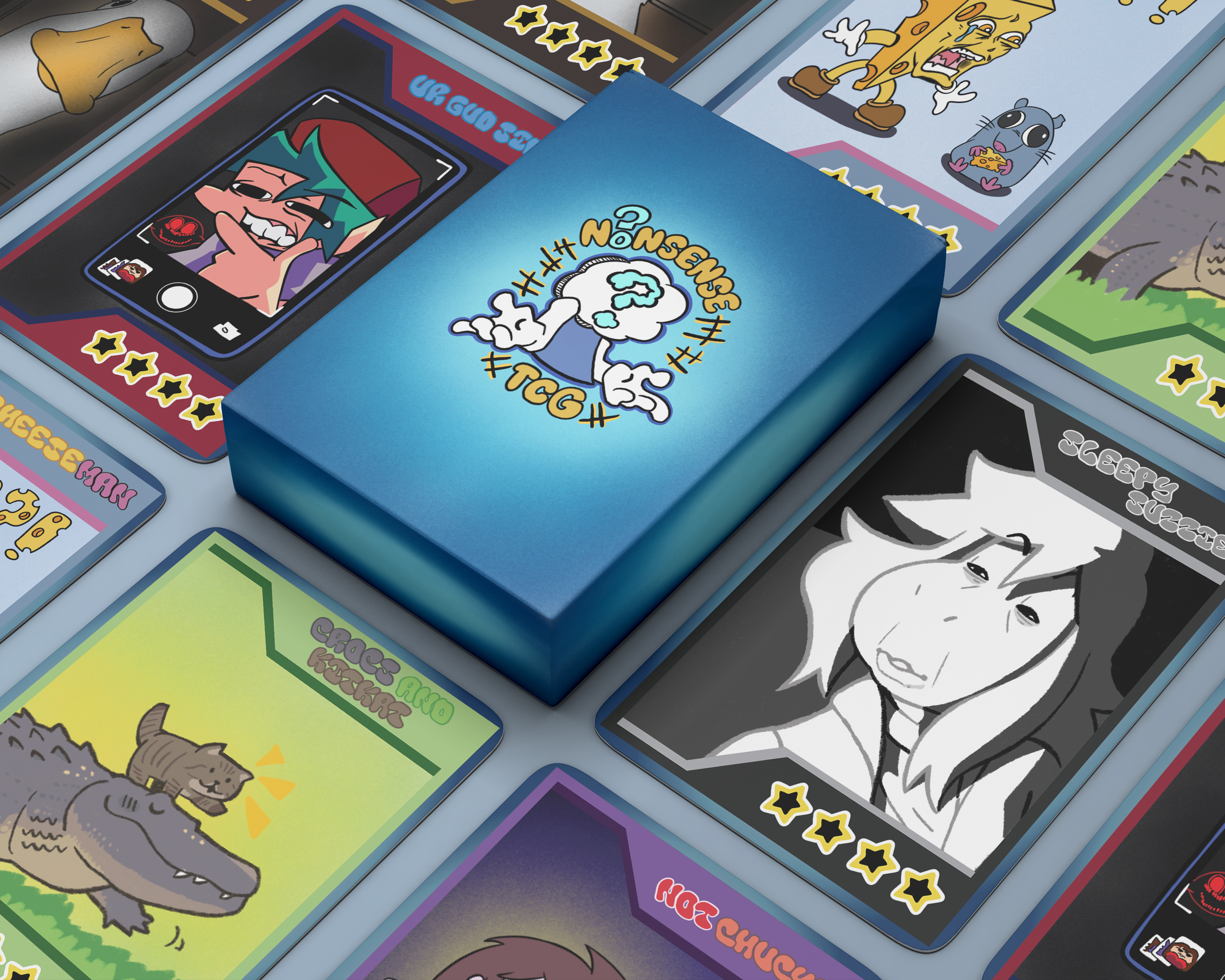
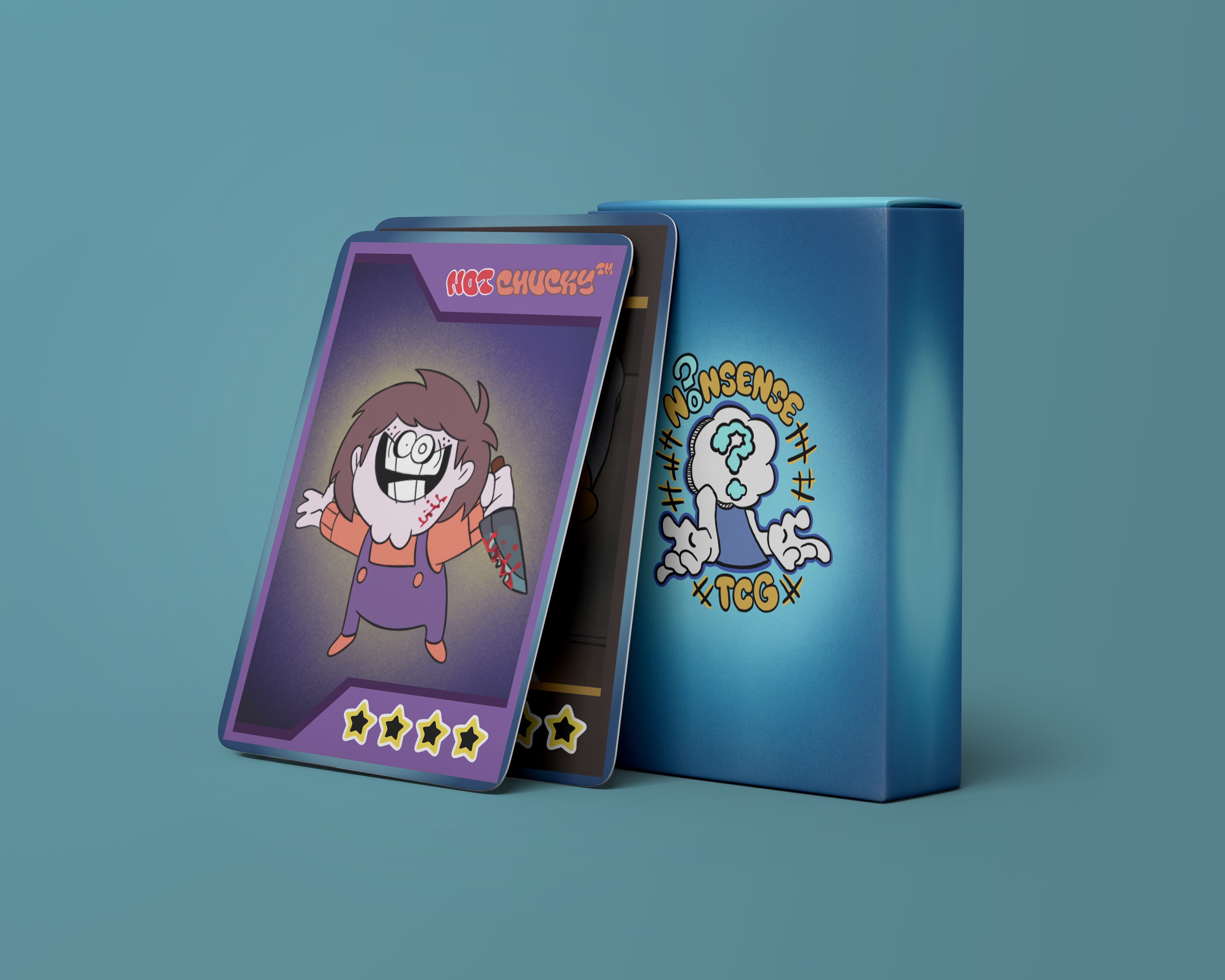
- Make a logo for the Nonsense trading card set
- Add card rarity
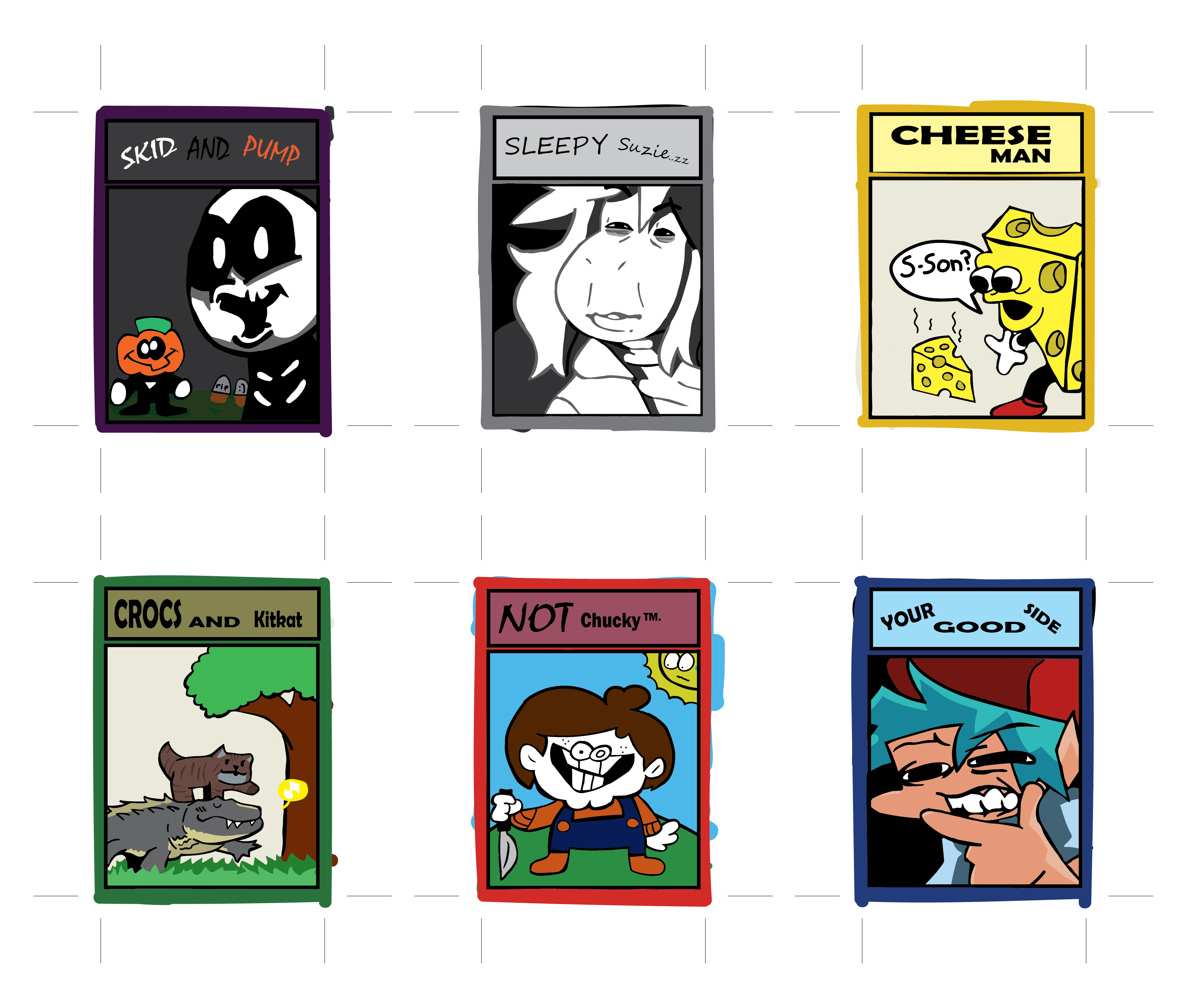
Original card designs
These are the original 6 card designs I made back in the first semester that I would like to improve
Front of cards
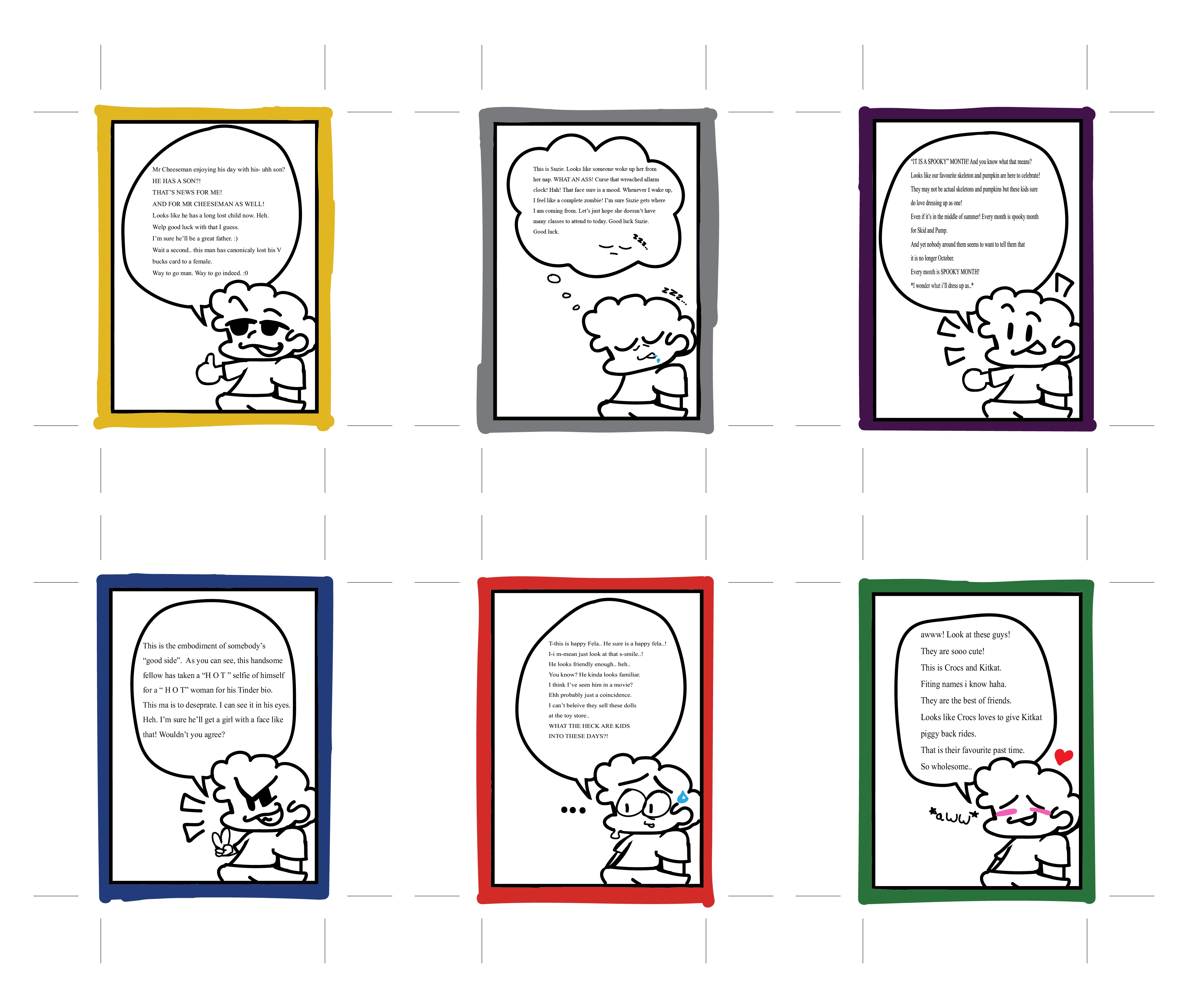
Back of cards
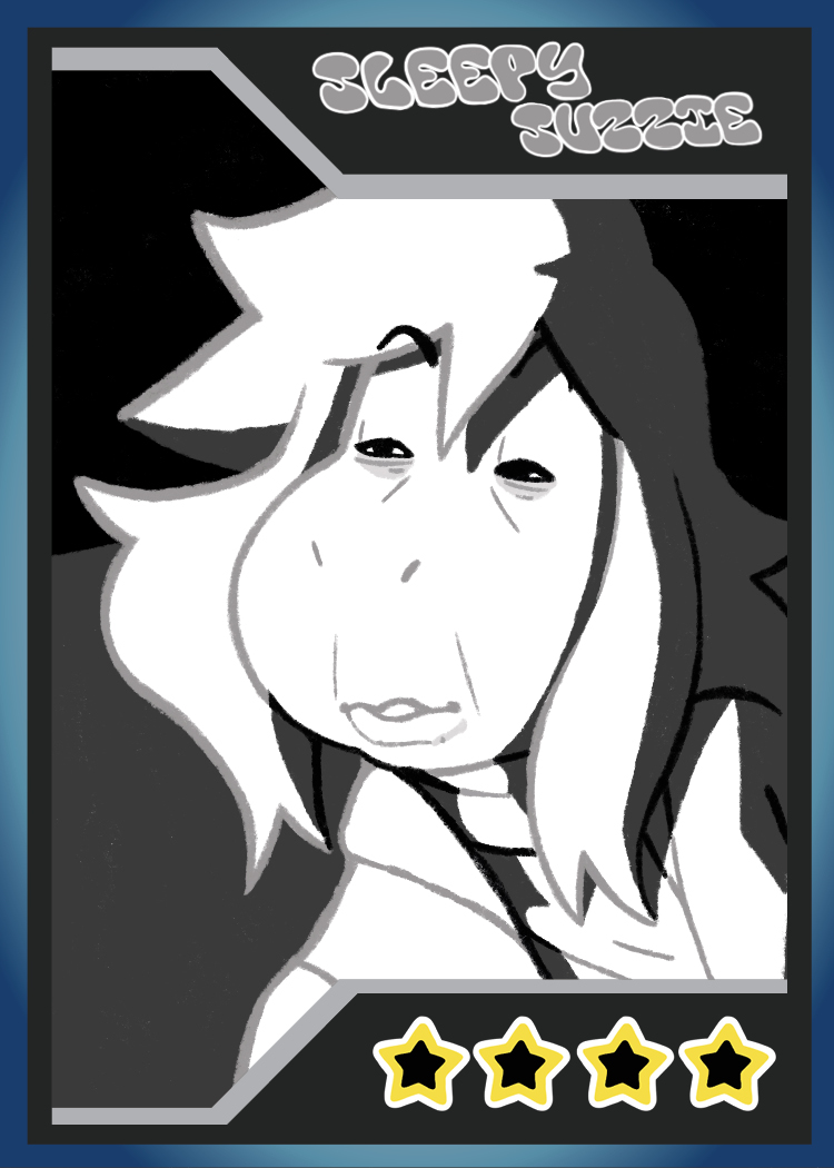
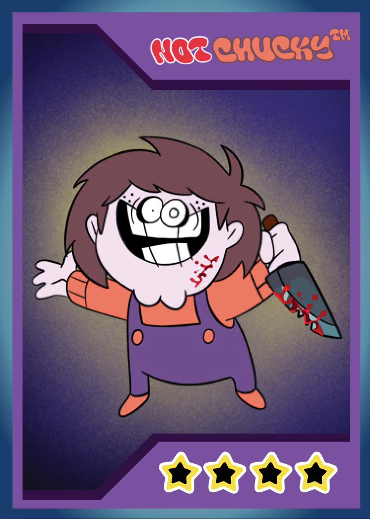
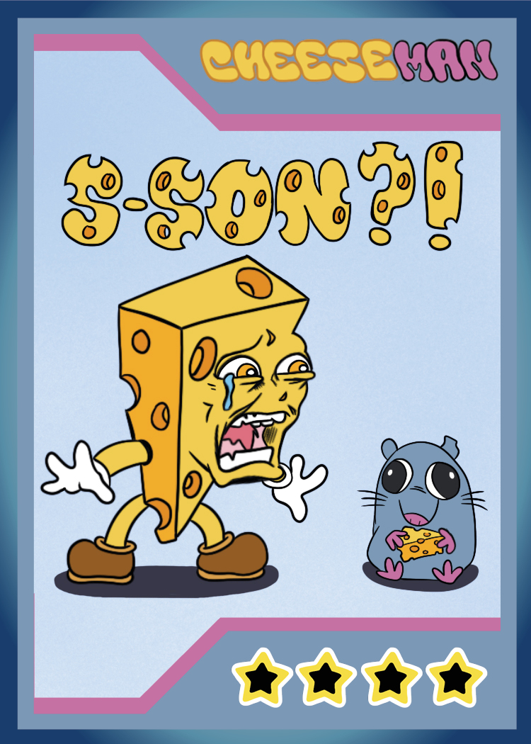
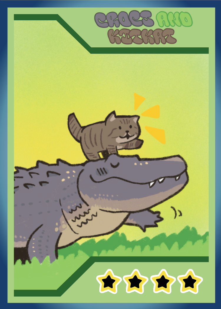
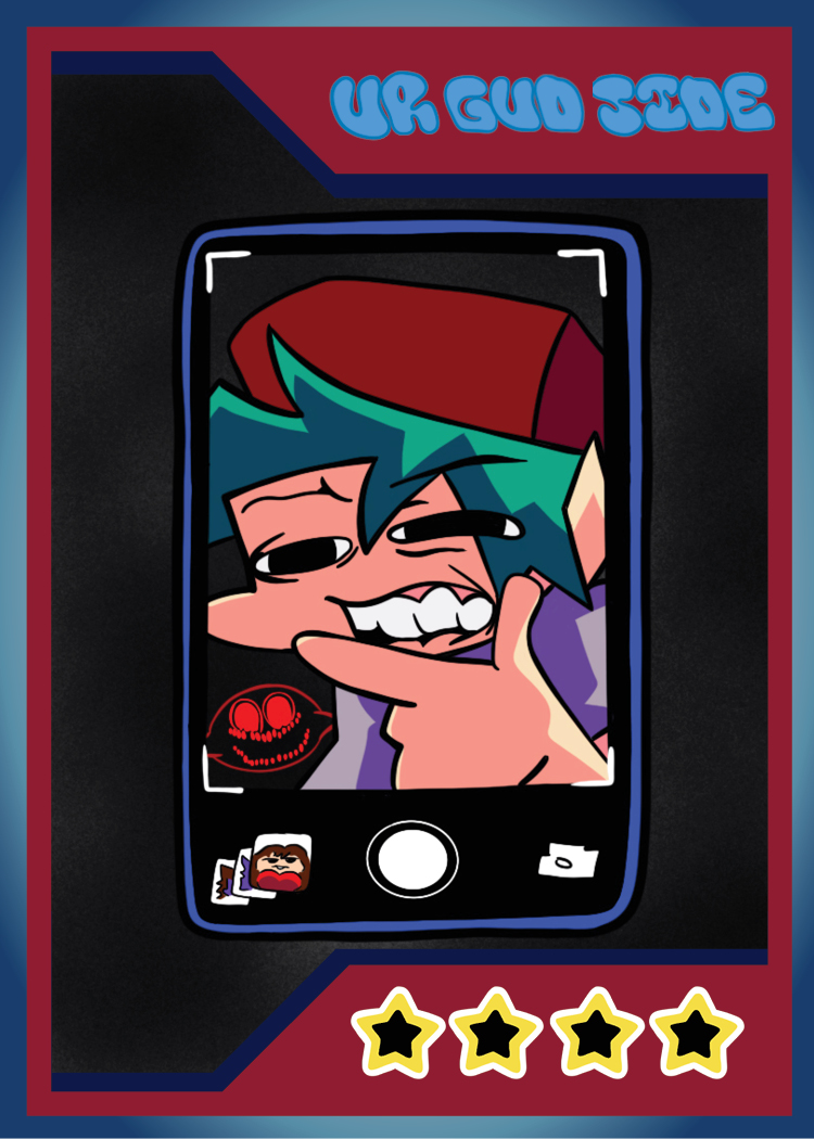
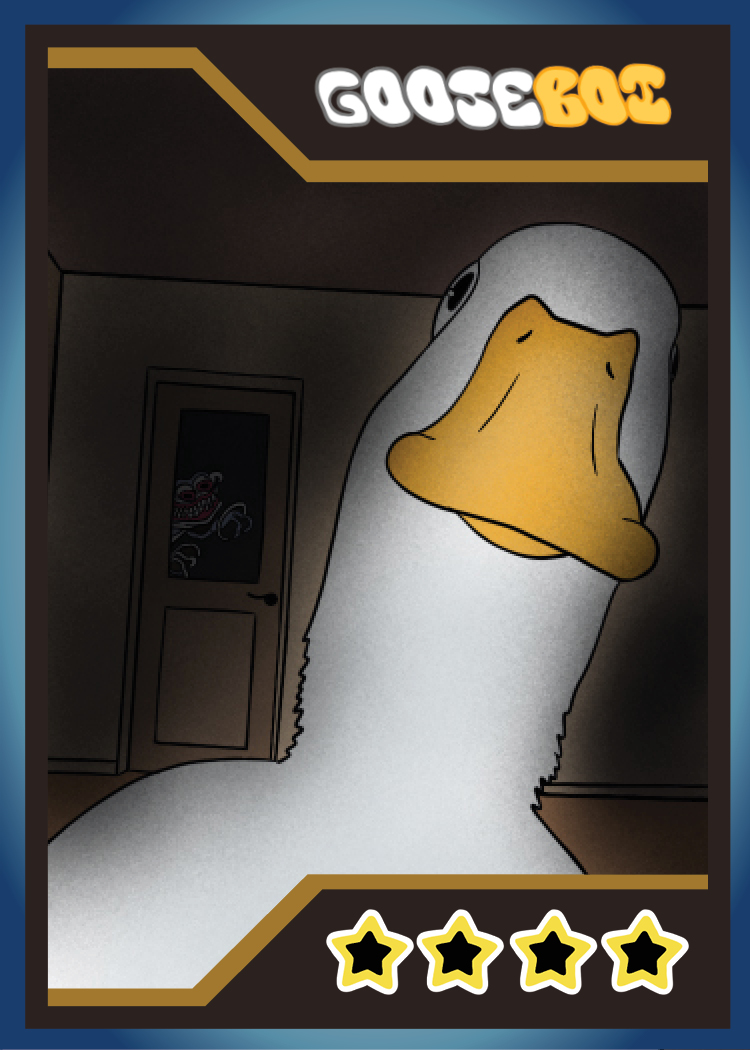
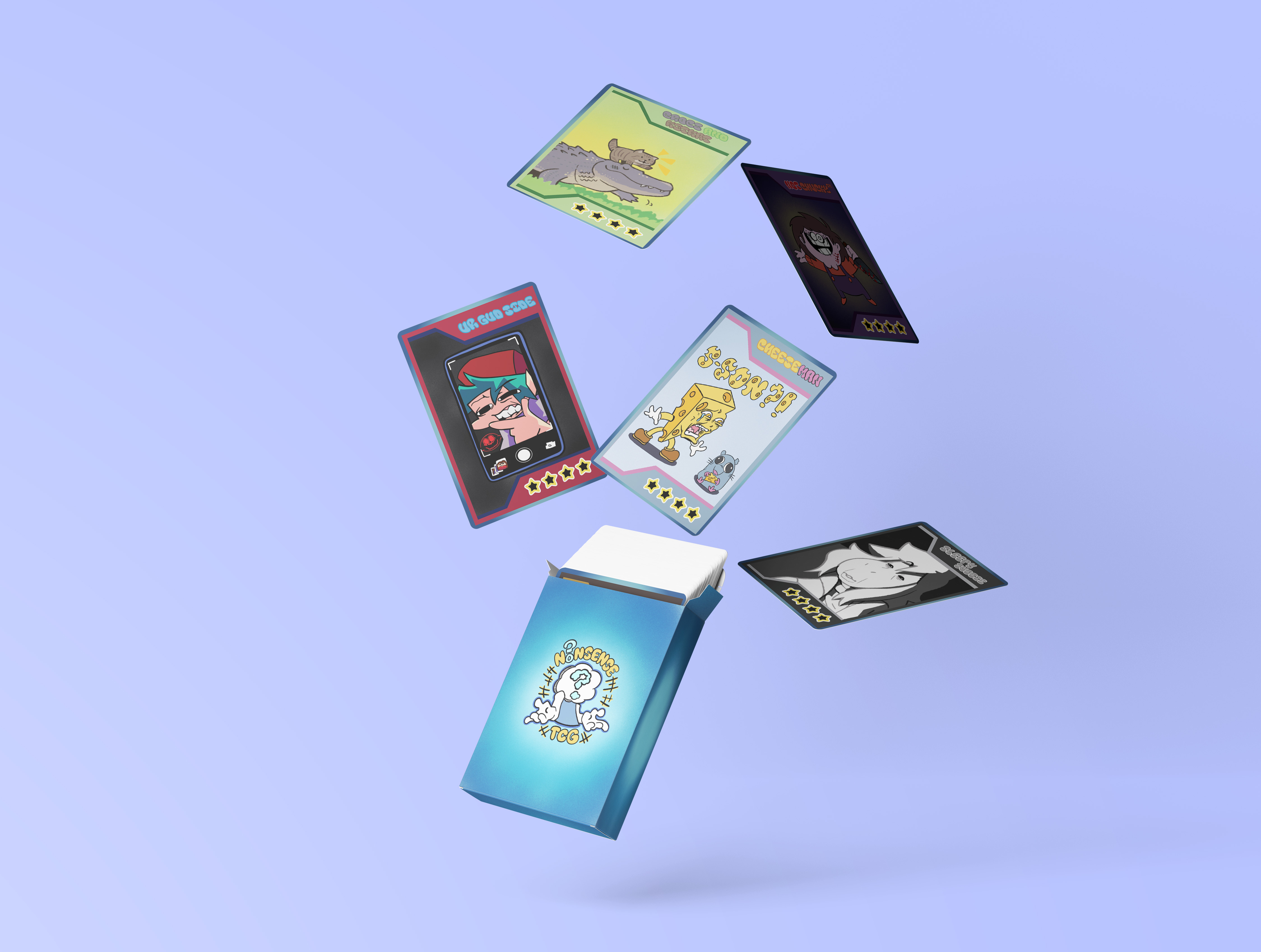
Revamped trading card designs
Here are the new and improved card designs by using other students feeback for help.
Web Improvement
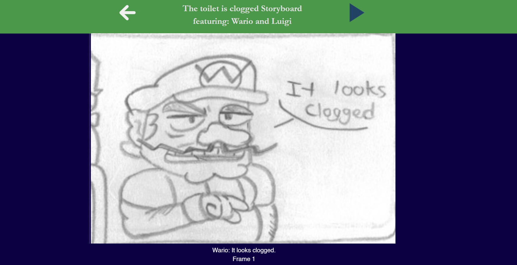
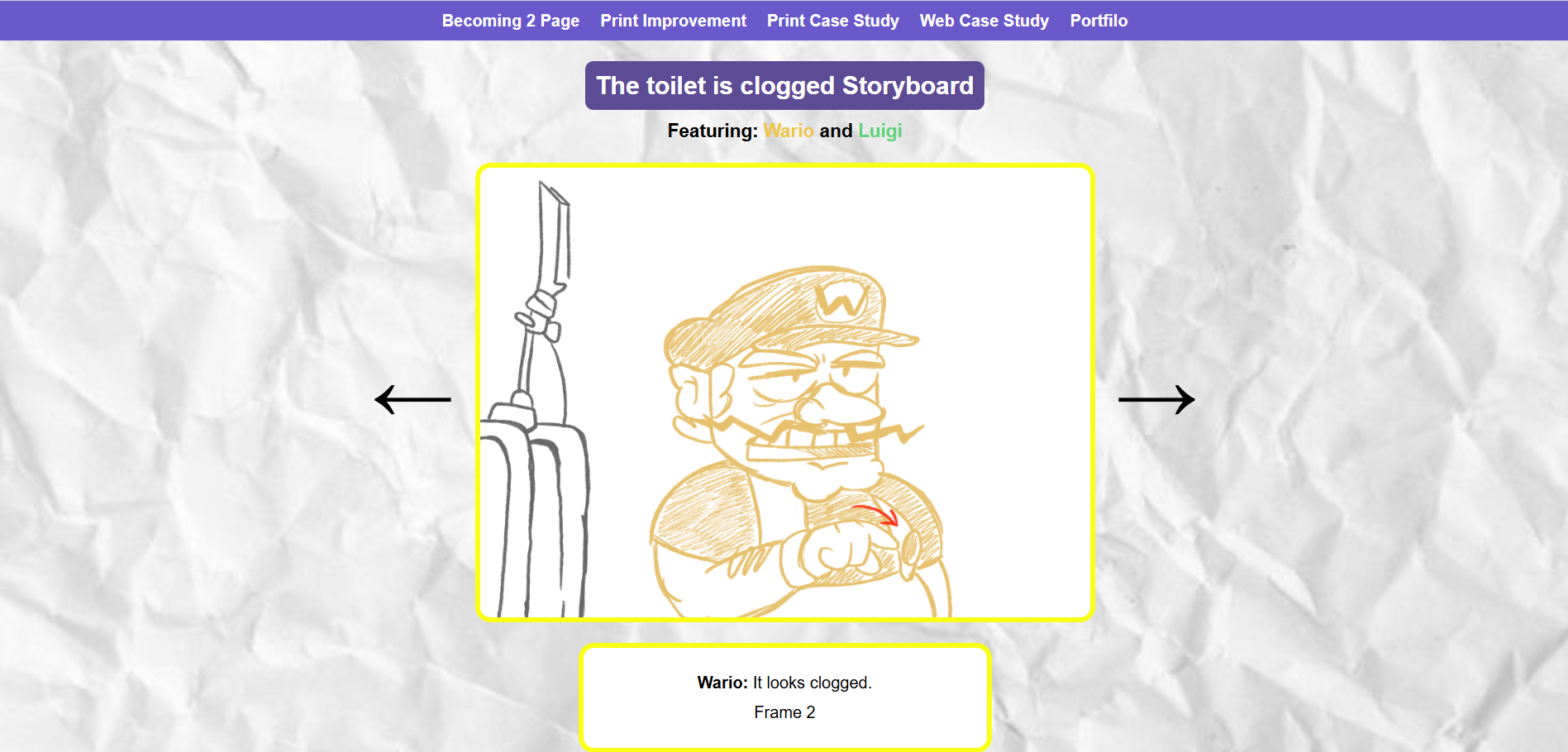
Storyboad showcase website
Why I want to improve this project?
I want to improve this project because the website itself looks very rushed. The storyboard frames are off centre and I would like to make the storyboard frames easier to visualize and more interactive.
Feedback from other students:
- Make the forward and back button look the same/consistent
- change fonts
- add more css styling because it looks very basic
- Make the dialogue text more visible/ easier to read (Maybe color code it to the character that is talking)
- remove the text bubbles in the drawings because the dialogue will be under the story board frames
The changes I will apply:
- No blurry images
- Make sure the story board frames aren't cropped
- Redraw of the frames to look more appealing
- add a link to the original scene that the story board is based off of
- Mobile friendly
- Add voice clips whenever you change frames
- Make dialogue text different colors when Luigi and Wario talks
- Pretty up the website page